

Our Brand Refresh
SimplePay will soon be sporting a “brand” new look. We’re excited to announce that we’re modernising our logo and website. We’re proud of this new look, and it has allowed us to reflect on our journey and the strides we’ve made since our inception.
Then and now…
Back in 2009, when SimplePay was taking its first steps, our original logo was the epitome of creativity on a shoestring budget. Like every startup, we needed a logo to make our mark! That initial design, charming in its simplicity, was our first visual identity:
Fast forward to 2011. As we grew and evolved, we decided to invest in a professionally designed logo that has represented us well for over a decade. The circular shape was not created out of thin air, but was actually derived from the hypotrochoids (yes, that’s a real word) used on South African bank notes:

Today, in 2024, we have a new logo that draws inspiration from the previous one, while being crafted to work seamlessly across the platforms and media we use. The cleaner lines and simpler font embody our focus on making complicated things simple:

Our new website:
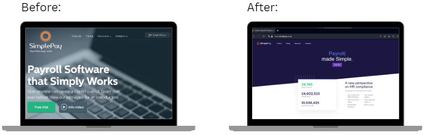
Our completely redesigned website will offer an enhanced user experience, with intuitive navigation tailored to new customers, and a mobile-friendly layout that adapts seamlessly to all devices. We feel the crisp lines and more vibrant colours better convey the energy of the incredible team here at SimplePay.
We hope you will love the changes as much as we do! Keep an eye out for the new website, and please share your thoughts with us at info@simplepay.hk. As always, we’re committed to delivering the same great service you’ve come to know and expect from SimplePay
Keep well,
Team SimplePay